Why Good UX/UI Design Increases Conversions (Not Just Looks)
Published on June 21, 2026
The link between UX/UI design and conversions is one of the most underappreciated relationships in business, because design is so often treated as decoration — a matter of taste, of making things look nice — rather than as a direct driver of revenue. It is, in fact, both. Good user experience and interface design don’t just make a website look professional; they systematically remove the friction that stops visitors from becoming customers. This guide explains exactly how design affects your conversion rate, what bad design quietly costs you, and what actually separates design that sells from design that merely impresses.
Here’s the reframe that changes everything: every visitor to your website arrives with some intention — to learn, to buy, to enquire, to sign up. Between that intention and the action you want them to take sits your design. Good design clears the path; bad design throws obstacles in the way. A confusing layout, a hard-to-find button, a form that asks too much, a page that loads slowly — each is a small obstacle, and each one loses you a percentage of the people who would otherwise have converted. Design isn’t the paint on the building; it’s the architecture of the path your customer walks.
UX and UI: what’s the difference, and why it matters
The terms get used interchangeably, but they describe related, distinct things, and conversions depend on both. UX — user experience — design is about how the whole thing works: how a visitor moves through your site, whether they can find what they need, whether the journey from arriving to converting is logical and frictionless. It’s the architecture and the flow. UI — user interface — design is about how the thing looks and feels at the surface: the visual design, the buttons, the typography, the colours, the spacing. It’s the finish on the architecture.
Both matter for conversion, but in different ways. Beautiful UI on top of broken UX is a gorgeous building with a confusing floor plan — people admire it and then leave because they can’t find the door. Sound UX with crude UI is a well-organised building that looks cheap, which undermines trust at exactly the moments it matters. The sites that convert well get both right: a logical, frictionless experience presented in a way that looks credible and professional. When people talk about “design” driving conversions, they really mean this combination working together.
How good design actually increases conversions
The connection between design and conversion isn’t vague or mystical; it operates through specific, identifiable mechanisms. Understanding them shows why design is a revenue lever, not a cosmetic one.
It removes friction at every step
Every extra click, every moment of confusion, every unnecessary form field is friction, and friction loses customers. Good design minimises the steps between intention and action — making the path to enquiring or buying as short and obvious as possible. A checkout with fewer steps converts better than one with more. A contact form asking for only what’s needed converts better than one demanding a life history. Reducing friction is perhaps the single most direct way design lifts conversion, and it’s almost always invisible to the visitor, which is exactly the point.
It builds trust instantly
Visitors decide whether to trust a website in seconds, largely on how it looks and feels, and trust is a prerequisite for conversion — nobody buys from, or enquires with, a business they don’t trust. A clean, professional, well-organised design signals competence and legitimacy before a single word is read. A dated, cluttered, or amateurish design signals the opposite, and visitors act on that impression whether or not it’s fair. For a business asking people to part with money or contact details, this first impression is doing quiet, constant conversion work.
It guides attention to what matters
Good design directs the eye. Through layout, hierarchy, contrast, and spacing, it leads visitors naturally toward the things you want them to notice and the actions you want them to take. A well-designed page makes the next step obvious; a poorly designed one leaves visitors unsure what to do, and unsure visitors do nothing. Guiding attention isn’t manipulation — it’s clarity, helping the visitor accomplish what they came to do, which usually aligns with what you want them to do.
It works on mobile, where your customers actually are
A large and growing share of web traffic — particularly in South Africa — is on mobile, and design that works beautifully on a desktop but awkwardly on a phone loses those visitors entirely. Genuinely good design is mobile-first: it works flawlessly on the small screen where most of your customers actually encounter you. A site that’s frustrating to use on a phone is leaking conversions from the majority of its traffic, often without the owner realising it.
The hidden cost of bad design
Because design’s effect on conversion is invisible, bad design’s cost goes unnoticed — which is precisely what makes it so expensive. A business with a poorly designed site doesn’t see the customers it’s losing; they simply leave, silently, and the owner concludes that “the website just doesn’t bring in much business” without realising the website is the problem.
Consider what bad design quietly costs. Visitors who can’t find what they need leave and buy from a competitor. A confusing checkout abandons sales at the final step. A form that asks too much deters enquiries. A site that looks untrustworthy loses cautious buyers. A poor mobile experience loses the majority of traffic. None of these losses appears on any invoice, which is why they’re so easily ignored — but added up across every visitor, every day, they represent a continuous, substantial leak of revenue. The most expensive design problems are the ones you never see.
This is why investing in good design so often pays for itself: a modest improvement in conversion rate, applied to all your traffic, compounds into significant revenue. A site that converts 3% of visitors instead of 2% isn’t a little better — it’s 50% more effective at turning the traffic you already have into customers, at no extra cost in traffic.
The principles of design that converts
Design that sells follows recognisable principles. None is exotic; together they describe the difference between a site that works and one that merely looks busy:
- Clarity above all. Visitors should understand what you offer and what to do next within seconds. Confusion is the enemy of conversion.
- Less, not more. Every element should earn its place. Clutter scatters attention; restraint focuses it. The most effective pages are usually the simplest.
- An obvious next step. Each page should make the desired action clear and easy. Visitors who don’t know what to do, don’t do anything.
- Minimal friction. Fewer clicks, fewer form fields, fewer steps. Remove everything between intention and action that doesn’t need to be there.
- Trust at every turn. Professional finish, clear information, visible proof, real contact details. Reassure the cautious visitor constantly.
- Mobile-first reality. Design for the phone, because that’s where most visitors are. A great desktop experience that fails on mobile fails most of your traffic.
- Speed as design. A fast page is part of good experience. Visitors abandon slow sites before design ever gets a chance to work.
Measuring whether design is working
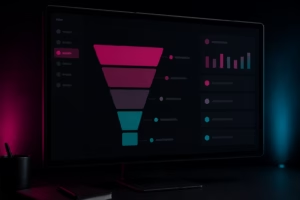
Because design’s impact is on behaviour, it can be measured — and should be, because measurement is what turns design from a matter of opinion into a matter of results. The headline metric is your conversion rate: the percentage of visitors who take the action you want. Track it, and you can tell whether design changes actually help.
Beyond that, analytics reveal where visitors drop off — which pages lose them, where they abandon a process, how far through a checkout they get before leaving. Each drop-off point is a design problem waiting to be fixed. Tools that show how people actually use your site, and structured testing that compares one design against another, let you improve based on real behaviour rather than guesswork. The best design teams don’t argue about taste; they test, measure, and let the conversion data decide. Design becomes a discipline of continuous, evidence-based improvement rather than a one-off act of decoration.
Signs your design is costing you customers
A few symptoms reliably indicate that design is leaking conversions. If several of these are true, your site is likely losing business you can’t see:
- High traffic but few enquiries or sales. If people arrive but don’t convert, the problem usually sits between arrival and action — which is design’s territory.
- Visitors leaving quickly. A high bounce rate often means people can’t immediately understand or navigate the site.
- Abandoned checkouts or half-finished forms. Drop-off at the final step almost always points to friction in the design.
- A site that looks dated. If your design feels years behind, it’s quietly undermining trust with every visitor.
- A poor experience on your own phone. If the site frustrates you on mobile, it’s frustrating the majority of your visitors.
How DIGIDMN approaches UX/UI design
We treat design as a business tool, not decoration — which means we design for conversion from the start, not as an afterthought once the site looks pretty. Every site we build is structured around the journey we want visitors to take, with friction stripped out of the path to enquiring or buying, attention guided toward the actions that matter, and trust built through professional finish and clear information. And because most of your customers are on a phone, we design mobile-first rather than treating mobile as a scaled-down version of the desktop.
We also believe design should be measured rather than guessed. We pay attention to how a site actually performs — whether it converts, where visitors drop off, what’s working — and treat design as something to improve continuously based on real behaviour. Good design isn’t a finished painting; it’s an ongoing effort to turn more of your traffic into customers.
The bottom line on UX/UI design and conversions
Good UX/UI design increases conversions because it removes the friction between a visitor’s intention and the action you want them to take, builds the trust that any conversion depends on, guides attention to what matters, and works where your customers actually are. Bad design does the opposite, quietly and invisibly, losing you customers you never see and revenue you never realise was within reach. The cost of bad design doesn’t appear on any invoice, which is exactly why it’s so easy to underinvest in good design — and so rewarding to get it right.
The businesses that win treat design as the architecture of their customer’s journey rather than the paint on the walls: clear, frictionless, trustworthy, mobile-first, and measured against real conversion data. Do that, and design stops being a cost you justify on taste and becomes an investment you justify on results — one of the highest-return improvements you can make to a website that already has traffic.
If you’d like a site designed to convert, not just to impress, see our UX/UI design service or get in touch for a free consultation. We’ll show you where your current design is likely losing customers and what would turn more of your visitors into enquiries.
Further reading: the Nielsen Norman Group publishes rigorous, research-backed articles on usability and user experience for those who want to go deeper.